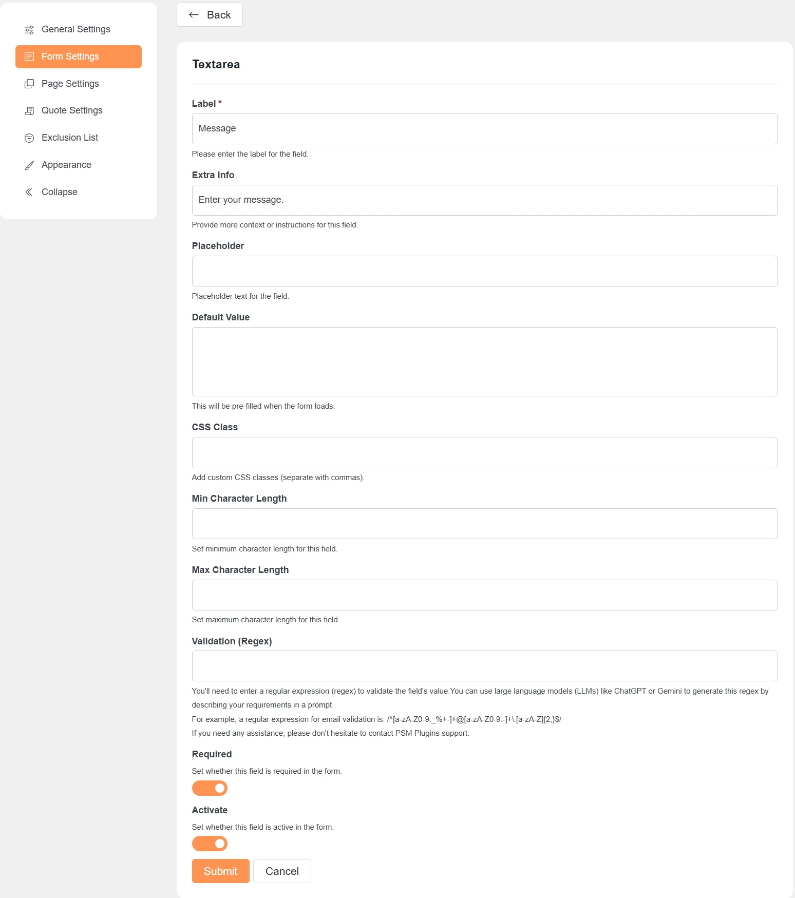
Label
This is the name of the field shown to customers.
Example: Message, Company Name.
Extra Info
Adds a short description below the field.
Use it to guide users on what to enter.
Placeholder
Shows sample text inside the field.
The text disappears when the user starts typing.
Default Value
Pre-fills the field when the form loads.
Useful for fixed or suggested values.
CSS Class
Add custom CSS classes for styling.
Use commas to add multiple classes.
Required
Makes the field mandatory.
The form cannot be submitted if this field is empty.
Activate
Controls whether the field is visible in the form.
Turn it off to hide the field without deleting it.
Validation Settings (If Applicable)
Min Character Length
Sets the minimum number of characters required.
Helpful for fields like message or name.
Max Character Length
Limits the maximum number of characters allowed.
Prevents very long inputs.
Validation (Regex)
Validates the field value using a regular expression.
Useful for emails, phone numbers, or custom formats.
You can use tools like ChatGPT or Gemini to generate regex patterns.
Notes
-
Not all options are available for every field type.
-
Settings appear based on the selected field type.
-
Always save changes after updating a field.