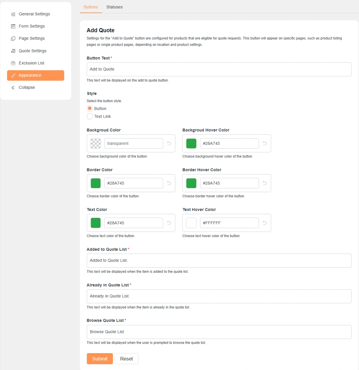
Appearance Settings (Common Options for All Buttons)
The appearance settings allow you to control how each button looks on the frontend.
These options are mostly the same for all buttons and help match your site design.
Button Text
Lets you change the label shown on the button.
Example: “Add to Quote”, “Accept”, or “Reject”.
Style
Choose how the button is displayed.
You can show it as a normal button or as a text link.
Background Color
Controls the main background color of the button.
You can use transparent or any custom color.
Background Hover Color
Sets the background color when the user hovers over the button.
This improves visibility and user interaction.
Border Color
Defines the border color of the button.
Useful for matching your theme style.
Border Hover Color
Changes the border color on hover.
Helps highlight the button when users move their cursor.
Text Color
Controls the text color of the button label.
Make sure it contrasts well with the background.
Text Hover Color
Changes the text color when hovering over the button.
Improves readability and visual feedback.
After adjusting the button settings, click Submit to save your changes.
Status Appearance Settings (Common Options for All Statuses)
These settings control how each quote status appears on the quote page.
They also define the message shown to customers for that status.
Label
Defines the name of the quote status.
This label is visible to customers on the quote page.
Background Color
Sets the background color for the status label.
Useful for visually distinguishing different statuses.
Text Color
Controls the text color of the status label.
Ensure good contrast for better readability.
Quote Page Default Message
This message is shown on the quote page when the quote has this status.
You can use basic HTML tags like <b>, <i>, <a>, etc., for formatting.
After updating any status settings, click Submit to save your changes.